1. Triangles
Instead of warning of market reversals, continuation patterns are usually resolved in the direction of the original trend. Triangles are among the most reliable of the continuation patterns. There are three types of triangles that have forecasting value – symmetrical, ascending and descending triangles. Although these patterns sometimes mark price reversals, they usually just represent pauses in the prevailing trend.
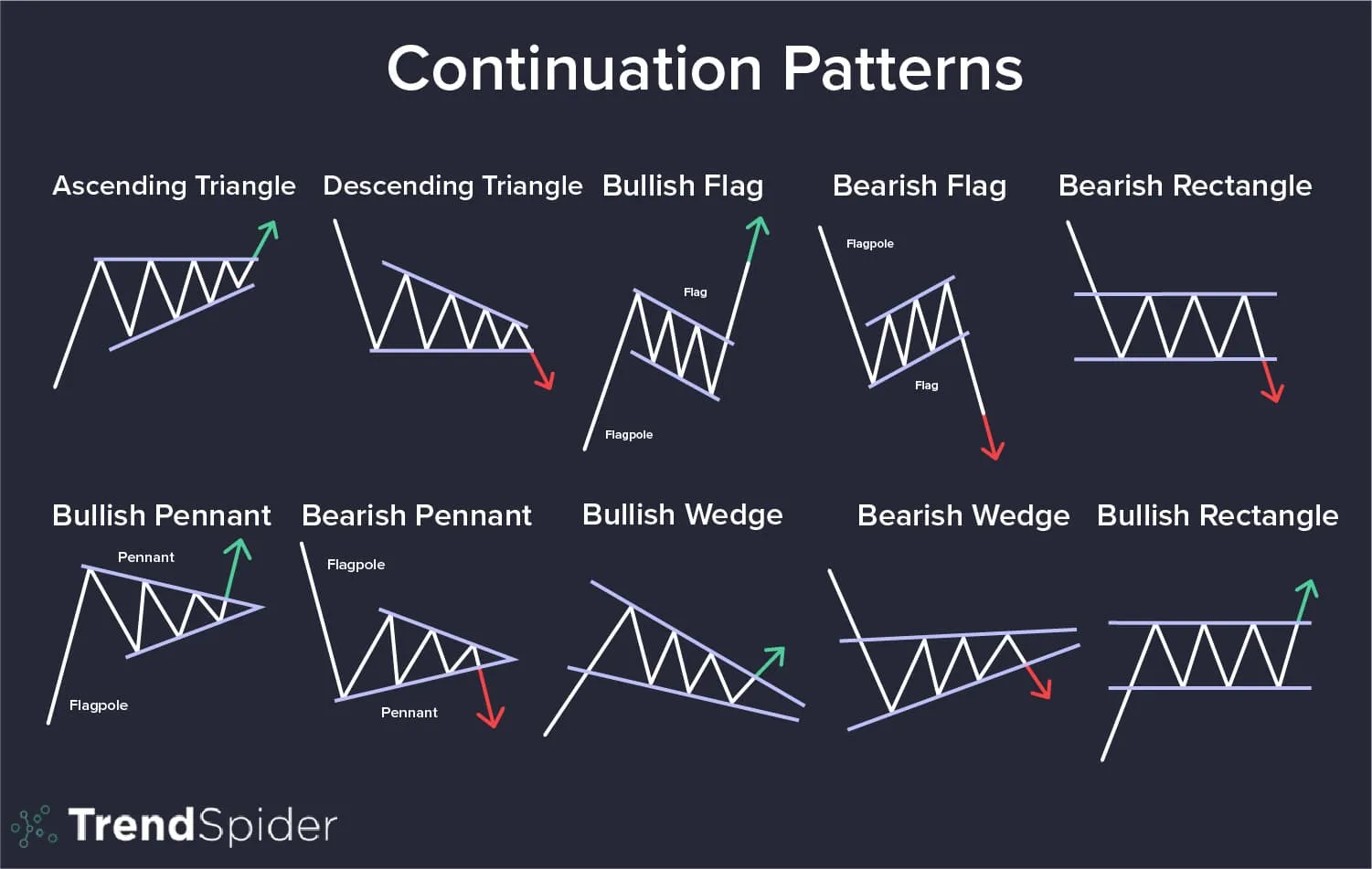
2. Symmetrical Triangle
The symmetrical triangle (also called the coil) is distinguished by sideways activity with prices fluctuating between two converging trend lines. The upper line is declining and the lower line is rising. Such a pattern describes a situation where buying and selling pressure are in balance.
Somewhere between the halfway and the three-quarters point in the pattern, measured in calendar time from the left of the pattern to the point where the two lines meet at the right (the apex), the pattern should be resolved by a breakout. In other words, prices will close beyond one of the two converging trend lines.
You will see this pattern during upward trends. It is like the stock has moved up from a lower price level, and just needs to ‘take a breather,’ so it pauses and consolidates. Notice the higher lows during the formation of this triangle. That indicates the uptrend is still in place, but simply doesn’t have enough momentum yet to move higher.
While watching one of these patterns form, several things cross the mind of a trader.
First of all, early on when the price moved up to around $50 the second time, but didn’t reach the previous high, the first thing that would come to mind as a trader/investor would be “That is a double top.” But the stock pulls back and holds above the previous low, so there is no reason to sell since the last known support (the previous ow) was held. It made a higher low which is good. The only problem at that point is the lower high it made. But then it advances again and makes another lower high. At this point, with two highs and two lows, a trend and channel line can be drawn creating the triangle. At that point, most traders are going to wait to see if a break out occurs before buying, or if a drop below the last support occurs before selling.
That explains why there is less buying on the advances, thus the lower highs. It just becomes a waiting game. They are not going to buy without a breakout and certainly not going to short-sell a strong stock that is making higher lows. But see what happened as soon as the stock advanced to break out above the old previous high? Yes! It ‘Gapped’ up the next day.
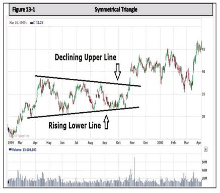
3. The Ascending Triangle
The ascending triangle is very similar to the symmetrical triangle with a rising lower trend line, except it has a flat upper channel line. In an ascending triangle pattern always appears that buyers are more aggressive than sellers since the lower trend line is rising and the upper channel line is flat. So this is usually a bullish pattern.
You can also see the lower trend line could have been drawn from the lowest low around 25, connecting the lows each time there was a pullback. Therefore by the time the stock broke out above the upper channel line, it had already found support along the trend line the fourth time.
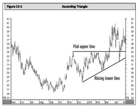
4. The Descending Triangle
This looks similar to this Ascending Triangle, except the descending triangle has a declining upper channel line and usually a near-flat lower trend line. This would indicate that the sellers are more aggressive than the buyers. So this is usually a bearish pattern.
The descending triangle usually forces a trader to wait and see what will happen. But the formation itself suggests it is bearish. Although no lower lows are being made, it is just holding support. In the mind of a trader, the lower highs indicate weakness, and each lower high suggests more weakness. So it always appears it is just a matter of time until the support fails to hold
Realistically, the stock only has two options. It either has to eventually break out above the declining channel line or fall through support. And the lower highs tell us the selling pressure is becoming stronger. So it becomes a squeeze.
Talking about Trend Lines, Descending lines, Ascending lines, Flat Bottoms, Bullish and Neutral, etc, it may get rather confusing. But when you look at the formation of a Triangle Pattern, the “Descending Triangle” having the flat bottom would tell you that the Buyers are not that excited – if they were, the bottom would not be flat – It would be ascending. Therefore it is a weak pattern that may not have the strength or momentum to advance.
Yet the symmetrical and ascending triangles are showing strength with the higher lows. Therefore, they are more likely to be advancing.
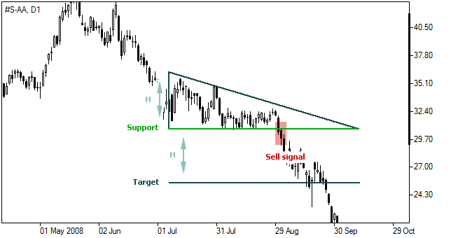
Another way to look at, and interpret a triangle is this: When you look at the wide end of the left side of a triangle, and then follow the lines to the point (Apex), it becomes rather obvious that something has got to give. It’s like squeezing a juice box from the bottom up. The more pressure that is applied, the more likely the juice is going to squirt out the straw.
That is why when the bottom trend line of the triangle is in an upward trend that is a pretty clear indication that the buyers are more aggressive. And eventually, they are likely to win the battle and the price will move higher.
Yet, when the bottom is flat, the buyers are not as aggressive; they are just holding and waiting. There are possibly a few new buyers that are buying at the support, but even those buyers are waiting for the stock to reach the support before buying, thus, no higher lows.
In the above chart, you can see when the stock finally broke below the support, many of those who were holding and waiting suddenly became sellers. This caused a dramatic drop very quickly, not to mention other traders who jumped in to short-sell the stock.
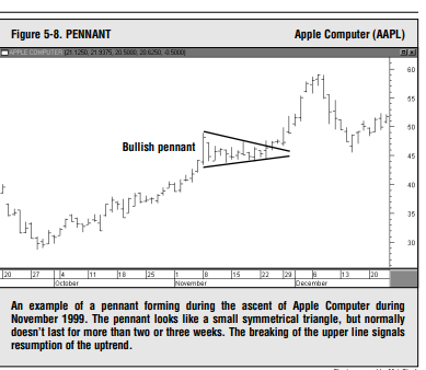
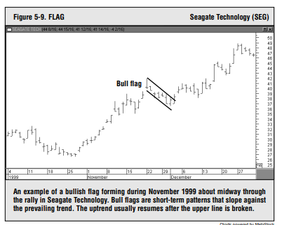
5. Flags & Pennants
These two short-term continuation patterns mark brief pauses, or resting periods, during dynamic market trends. Both are usually preceded by a steep price move (called the pole). In an uptrend, the steep advance pauses to catch its breath and moves sideways for two or three weeks. Then the uptrend continues on its way. The names aptly describe their appearance.
The pennant is usually horizontal with two converging trend lines (like a small symmetrical triangle). The flag resembles a parallelogram that tends to slope against the trend. In an uptrend, therefore, the bull flag has a downward slope; in a downtrend, the bear flag slopes upward.
Both patterns are said to “fly at half mast,” meaning that they often occur near the middle of the trend, marking the halfway point in the market move. In addition to price patterns, several other formations show up on the price charts and that provide the chartist with valuable insights. Among those formations are price gaps, key reversal days, and percentage retracements.
Financial and Business expert having 30+ Years of vast experience in running successful businesses and managing finance.